OR The Power of Red & Black in Advertising. The “Temptation” ad from my previous blog inspired this. Since the beginning of advertising the “creative mind” has literally banked on fear and nothing has changed. The all ever popular soap commercials of radio, that led to the soap commercials for soap operas on TV, are steeped in fear. Yes of course we need and use soap for cleaning things we use daily and our personal hygiene, however it’s the way the message is shaped.
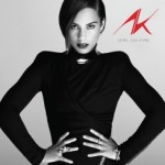
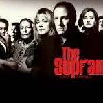
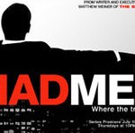
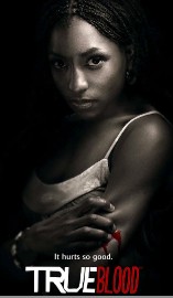
Soap being at the bottom of the birth of what we believe to be a necessary evil, has forever set the foundation of perception. At the end of the day, it’s clean… but is it? Listen, you and I know better, we’ve lived long enough that we can read between the lines… but as much as we’re exposed and consumed by bullsh*t, don’t we need to have some avenue of telling the truth in the same light? I don’t know… those of you like me who take a minute to write down a thought, something you believe to be a profound moment of consciousness… is writing a blog the only way? Do I digress? I’m going off on a tangent, I’m venting, typing what I’m thinking as it strikes me, I’m basically saying that the constant barrage is overwhelming at times, just too excessive, even for me and I know what’s going on – I get it, God help the mind that has to figure it out, if an education, blog, film or another person doesn’t break it down for them. As much as I am borderline offended, I am one that has succumbed, as the game was already in play long before I got here. It’s presence was in my face before I even knew what was happening. Advertising for film and television releases in the month of March are on fire! On the tail end of (and still getting recurring air-play) success of Alicia Keys’ female anthem “Girl On Fire,” the color for advertising in excess right now, is red. Did one agency get all the work or did the results simply come back from the lab to go with red for new stuff in March? Maybe that’s the memo every year or every other quarter… Target made red their Staple(s) with the old bulls-eye. Maybe I’m just noticing red a lot this season. No, but wait… they’ve been doing that, I guess I’m just feeling like it’s the hard sell at the moment and I’m not sure I like it. I do like “True Blood”, which was preceded by “The Sopranos”, those ads are/ were red and black. “Mad Men,” a show about the early days of advertising and the men at the foundation of what the ad world has become, uses red and black in their advertising. Additionally the lead actress, Joan Holloway, is constantly being dressed in red on the show or when strolling a red carpet. Red and black are always used to express sex, passion, love, fear or death.
Living in NYC, the vast majority of us ride the subway, among the various ads we’re seeing right now in abundance are different aspects of fear, despair, murder and defeat. “Temptation” represents the fear of doing something bad by committing adultery; “Red Widow” is about a woman in fear of her life because she was the wife of a gangster, now she’s gotta be bad; “The Call” stars Oscar winning actress Halle Berry, who is a 911 operator in pursuit of a serial killer; HBO’s “Phil Spector” starring Oscar winners Al Pacino and Helen Mirren covers the music producers life, straight through to his trial for murdering his wife; “Olympus Has Fallen” is about terrorist attacks against our government; and “The Voice” focuses on eliminating a multitude of aspiring pop-stars, by airing the defeat of all others that don’t have “The” Voice… although several have an opportunity to develop a creative avenue for themselves once they appear on the show. 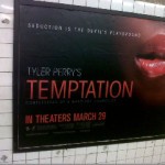
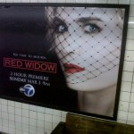


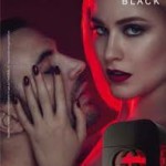
Red and black have been signature colors for movie ads for years, from full blown use of the colors, to just a splash — and always connected with films that have a dark side, or of a passionate nature…
Even when red and black are being used for ads that are for organizations to help or benefit people, there’s always death or despair connected…
“Helter Skelter”
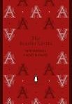
was first published in 1974 and became a bestseller. The book takes its title from the song by The Beatles, which author Bugliosi claims Charles Manson was obsessed with. It won a 1975 Edgar Award for Best Fact Crime book and was the basis for two television films in 1976 and 2004. Long before “Helter Skelter” was the ever popular “The Scarlet Letter” back in 1850. This was the oldest example I could think of where the color red was controversial, dangerous or tabu, other than “Little Red Hiding Hood.” According to The Telegraph, Dr Jamie Tehrani, a cultural anthropologist at Durham University, studied 35 versions of ‘Little Red Riding Hood’ from around the world. Whilst the European version tells the story of a little girl who is tricked by a wolf masquerading as her grandmother, in the Chinese version a tiger replaces the wolf. The old folk tale was brought back to life as recent as 2011.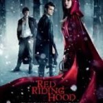 Mark Mothersbaugh started the group DEVO in 1973.
Their red hats, black t-shirts and black jeans were a long-time signature outfit. I saw them perform at The Palladium in 1979. Mark descended via a rope from the balcony singing “We are Devo,” as the crowd screamed in reply “D-E-V-O”! 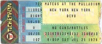
Since those days he produced most of pop-star Toni Basil’s music; scored music for children’s television shows “Rugrats”; “Clifford the Big Red (coincidence?) Dog” and “Regular Show”; as well as music for EA Games and Apple. He composed the score for the first season of the HBO television series “Big Love,” but was replaced after one season by David Byrne of the Talking Heads. Mothersbaugh also composed the theme for the SyFy channel’s “Eureka.” He currently hosts a drawing segment on Nick Jr’s “Yo Gabba Gabba” and has received a BMI songwriters award and an honorary doctorate of music degree. Mothersbaugh is a prime example of one that has taken the tools of music and media and RAN with it.
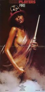
The Ohio Players had one of their biggest hits in FUNK with their classic hit “Fire.” The cover art from the band is all too well known by the group’s fans, as it always featured a beautiful woman. Red and black are always associated with blood, darkness, something hot or dangerous. KFC used red and black as their signature colors to enhance they were giving you something spicy. Kentucky Fried Chicken was founded by Harland Sanders in 1930.
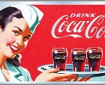
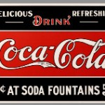
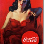
He began selling fried chicken from his roadside restaurant in Corbin, Kentucky during the Great Depression. Sanders was an early pioneer of the restaurant franchising concept, with the first “KFC” franchise opening in Utah in 1952. Oh boy, I had no idea this was going to turn into a red semiotic journey when I got started – I have to stop lol, I’m actually laughing… here’s some more images that tell the story better than I can in words… The oldest giant in marketing a product I found using red was Coca-Cola. Did you know that Coke has it’s own trademark for the shade of red they use?
Rihanna has made red her signature color… has a black gun tattooed on her torso and recorded the song
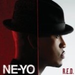
For a clearer defined perspective on the love, passion and shameless marketing tactics used by way of the colors red & black.
c-dub

