Have you ever wondered how the whole blue state vs. red state thing really works in the Electorial College? Here is a cool set of maps that make it a little easier to understand.
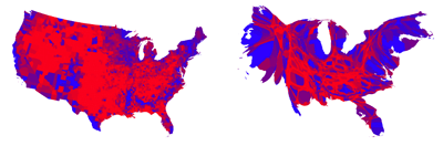
1.Electorial College results showing President Barack Obama’s re-election victory – Red states are for Republican Mitt Romney, and blue for Democratic incumbent Barack Obama. Obama won, even though the country appears mostly red. The blue area is smaller, but it represents the larger population of voters, which is what counts in an election.

2. The Electorial College image adjusted with a cartogram, which substitutes another variable for geography. In this case, the states are resized based on their population. Now the country appears mostly blue.

3. The election is decided not by population, but by the Electoral College. Each state contributes a certain number of electors, with less populated states slightly favored. The electors vote according to the majority in their state. (Except for Maine and Nebraska, which split them.) The candidate with the most electoral votes wins. This image shows which candidate won more Electoral College votes.

4. As the image makes clear, a large swath of the country is evenly divided (purple). Heavily Democratic areas (blue) are visible in larger cities. Strongly Republican areas (red) show smaller populations, which is why they are smaller on the map.

Source: Mark Newman of the Department of Physics and Center for the Study of Complex Systems at the University of Michigan
Note: The election is decided not by population, but by the Electoral College. Each state contributes a certain number of electors, with less populated states slightly favored. The electors vote according to the majority in their state. (Except for Maine and Nebraska, which split them.) The candidate with the most electoral votes wins.