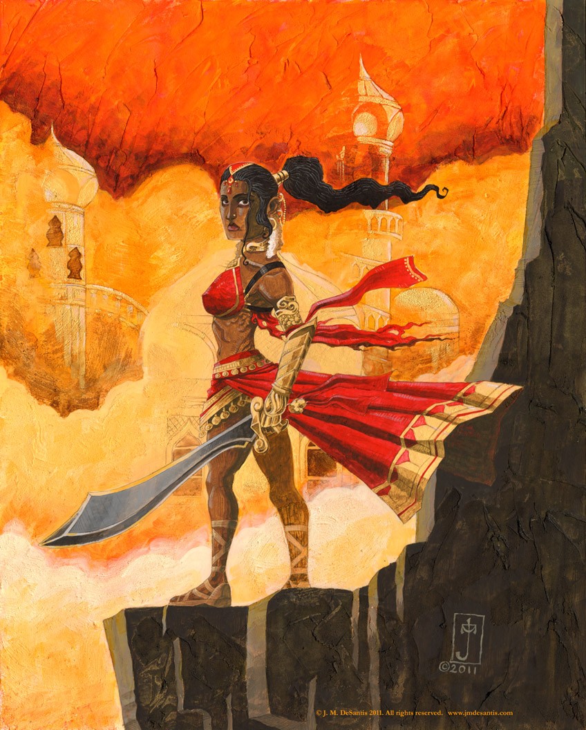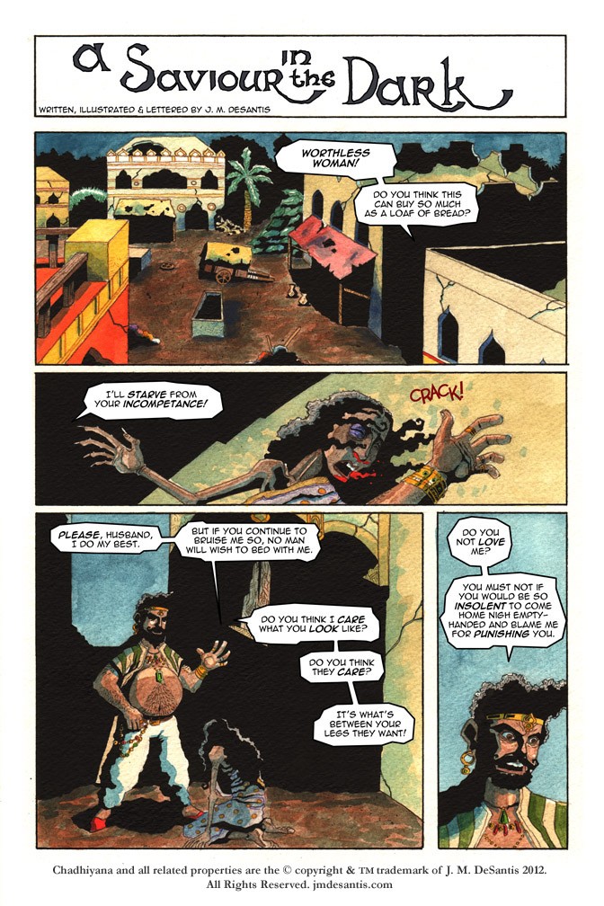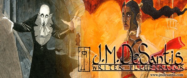
I met JM at the Bronx Heros Comic Con this year. We discussed his work and I mentioned that I thought it would be a good fit with our Aesthetic Groove blog. I would like to thank JM for for submitting his work. Much success on “A Saviour in the Dark” and “Chadhiyana and the Serpent”. Looking forward to seeing you at New York Comic Con.
BIO:
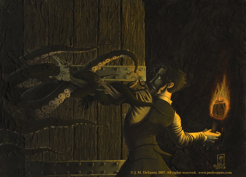
J. M. DeSantis is a writer and illustrator known for his work in the genres of fantasy, horror and humour. He is the author of a number of short stories, comic scripts and articles, and his art has graced the pages of various books, comics and magazines.
J. M.’s career began in 2007 when he penciled a comic story, “Recollections of a Commander,” for the Comicbook Artists Guild. Since then, J. M.’s stories and art have seen publication by various publishers, including Heavy Metal Magazine, Norgus Press, Static Movement, Guild Works Publications, and Atlas Unleashed. His illustration work has been nominated twice for awards from the Comicbook Artists Guild.
As always, J. M. DeSantis is working on a variety of writing and illustration projects, including bringing his new fantasy heroine, Chadhiyana, to life. He currently resides in the greater New York area. To see more of his work and to stay up-to-date on his current and future projects visit www.jmdesantis.com.
ARTIST’S STATEMENT:
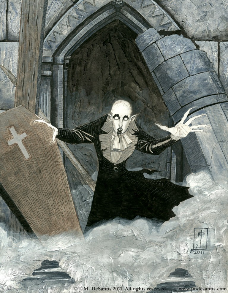
In a dominantly digital age, I am, first and foremost, a traditional artist, preferring pencil and paper to a tablet and computer screen. I delight in having physical contact with the work I create and being able to touch and hold an original piece when my work is complete. Though I’m not a fine artist by trade, I take a somewhat fine art approach to my illustrations, not only by working traditionally, but also by creating art that looks like art rather than a photograph. Realism is not something I strive for.
To further enhance this “art that looks like art” approach, I rely heavily on textures, allowing brush strokes to show, in many cases, and even creating new textures with the materials I use. However I use negative space and large areas of deep shadow to create contrast with the textures and give the eye a place to rest. Often I try and chose a colour scheme for a piece. When not using black for shadows, I pick a colour to be dominant colour or focal point of a piece and use its complimentary colour in the shadowed areas to help enhance that particular colour.
When not working in black and white (which is done strictly in inks), I prefer mixed media, combining acrylics or watercolours with inks and coloured pencils. Also in my acrylic paintings I add the use of molding paste, which gives those works a very physical and three-dimensional look.
J.M. DeSantis NY Comic Con cira 2010